It was recently unveiled the latest findings from our 2017 Health Plan Survey. With data on 20,099 health plans sponsored by 11,221 employers, the UBA survey is nearly three times larger than the next two of the nation’s largest health plan benchmarking surveys combined. To learn more, watch this short video below.
We recently unveiled the latest findings from our 2017 Health Plan Survey. With data on 20,099 health plans sponsored by 11,221 employers, the UBA survey is nearly three times larger than the next two of the nation’s largest health plan benchmarking surveys combined. Here are the top trends at a glance. Cost-shifting, plan changes, and other protections influenced rates
Sustained prevalence of and enrollment in lower-cost consumer-driven health plans (CDHPs) and health maintenance organization (HMO) plans kept rates lower.
For yet another year, “grandmothered” employers continue to have the options they need to select cheaper plans (ACA-compliant community-rated plans versus pre-ACA composite/health-rated plans) depending on the health status of their groups.
Increased out-of-network deductibles and out-of-pocket maximums, with greater increases for single coverage rather than family coverage, as well as prescription drug cost shifting, are among the plan design changes influencing premiums.
Overall costs continue to vary significantly by industry and geography
Retail, construction, and hospitality employees cost the least to cover; government employees (the historical cost leader) continue to cost among the most.
As in 2016, plans in the Northeast cost the most and plans in the Central U.S. cost the least.
Retail and construction employees contribute above average to their plans, so those employers bear even less of the already low costs in these industries, while government employers pass on the least cost to employees despite having the richest plans.
Plan design changes strained employees financially
Employee contributions are up, while employer contributions toward total costs remained nearly the same.
Although copays are holding steady, out-of-network deductibles and out-of-pocket maximums are rising.
Pharmacy benefits have even more tiers and coinsurance, shifting more prescription drug costs to employees.
PPOs, CDHPs have the biggest impact
Preferred provider organization (PPO) plans cost more than average, but still dominate the market.
Consumer-driven health plans (CDHPs) cost less than average and enrollment is increasing.
Wellness programs are on the rise despite increased regulations and scrutiny Metal levels drive plan decisions
Most plans are at the gold or platinum metal level reflecting employers’ desire to keep coverage high. In the future, we expect this to change since it will be more difficult to meet the ACA metal level requirements and still keep rates in check.
Key trends to watch
Slow, but steady: increase in self-funding, particularly for small groups.
Employer-sponsored health insurance is greatly affected by geographic region, industry, and employer size. While some cost trends have been fairly consistent since the Patient Protection and Affordable Care Act (ACA) was put in place, UBA finds several surprises in its latest Health Plan Survey. Based on responses from more than 11,000 employers, UBA recently announced the top five best and worst states for group health care monthly premiums. The top five best (least expensive) states are:
1) Hawaii
2) Idaho
3) Utah
4) Arkansas
5) Mississippi
Hawaii, a perennial low-cost leader, actually experienced a nearly seven percent decrease in its single coverage in 2016. New Mexico, a state that was a low-cost winner in 2015, saw a 22 percent increase in monthly premiums for singles and nearly a 30 percent increase in monthly family premiums, dropping it from the “best” list. The top five worst (most expensive) states are:
1) Alaska
2) Wyoming
3) New York
4) Vermont
5) New Jersey
The UBA Health Plan Survey also enables state ranking based on the average annual cost per employee. The average annual cost per employee looks at all tiers of a plan and places an average cost on that plan based on a weighted average metric. While the resulting rankings are slightly different, they also show some interesting findings.
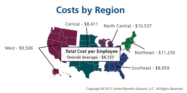
The 2016 average annual health plan cost per employee for all plan types is $9,727, which is a slight decrease form the average cost of $9,736 in 2015. When you start to look at the average annual cost by region and by state, there is not much change among the top from last year. The Northeast region continues to have the highest average annual cost even with the continued shift to consumer-driven health plans (CDHP). In 2016, enrollment in CDHPs in the Northeast was 34.9 percent, surpassing those enrolled in preferred provider organization (PPO) plans at 33 percent. Even with the continued shift to CDHPs, the average annual costs were $12,202 for New York, which remained the second-highest cost state, followed by $12,064 for New Jersey, and rounding out the top five, Massachusetts and Vermont flip-flopped from 2015 with Massachusetts at $11,956 and Vermont at $11,762.
As was the case in 2015, Alaska continues to lead all states in average health plan costs, topping New York by more than $1,000 per employee, with an average cost of $13,251. While year-over-year the average cost for Alaska only increased 3.35 percent, the gap increased to 36.2 percent above the national average of $9,727.
Keeping close to the national average increase, the top five states all saw a year-over-year increase of less than 4.5 percent. Unfortunately, even at a modest increase, the one thing that the top five have in common is that they all are more than 20 percent above the national average for health plan costs per employee.
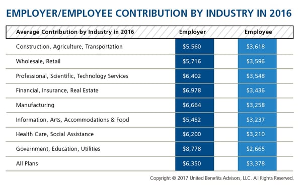
We recently shared healthcare cost benchmarking best practices and reported on the best and worst industries/states for group healthcare. But how much are you contributing toward healthcare costs vs. your employees? That’s a key benchmark, especially when “cost-shifting” is the main strategy for mitigating risk for employers. You may have the most affordable plan, but if you are passing most of that cost on to your employees, you may not be a competitive employer.
According to the latest UBA Health Plan Survey, total costs per employee for the retail, construction, and hospitality sectors are 4.3 percent to 11.3 percent lower than average, making employees in these industries among the least expensive to cover. But employees in the retail and construction sectors pay 6.3 percent and 6.8 percent above the average employee contribution, respectively (hospitality employees pay slightly below the average employee contribution).
On the other end of the cost spectrum, the government sector has the priciest plans ($11,443 per employee) and passes on the least cost to employees, whose average contributions are more than 23 percent less than average. (Surprisingly, these employees are experiencing sticker shock this year since they’ve seen a 26.6 percent increase in their contributions, which were 45.2 percent below average last year.)
When employees’ out of pocket costs are rising, carefully considering and benchmarking their contributions toward the total cost is important—and not nationally, but compared to your peers. Here’s a look at all the average employer/employee contributions by industry:
Many employers benchmark their health plan against carrier provided national data. While that is a good place to start, regional cost averages vary, making it essential to benchmark both nationally and regionally—as well as state by state. For example, a significant difference exists between the cost to insure an employee in the Northeast versus the Central U.S.—plans in the Northeast continue to cost the most since they typically have lower deductibles, contain more state-mandated benefits, and feature higher in-network coinsurance, among other factors.
Drilling down even more, comparing yourself to your industry peers can tell a very different story.
Consider a manufacturing plant in Georgia that offers a PPO. Its premium cost for single coverage is $507 per month. Compare this with the benchmarks for all plans and you can see that it is $2 per month less than the national average. When compared with other PPOs in the Southeast region, this employer’s cost is actually $2 more than the average. This employer’s cost appears to be higher or lower compared with national and regional benchmarks, depending on which benchmark is used. Yet this employer’s cost is actually higher than its closest peers’ costs when using the state-specific benchmark, which in Georgia is $468. Bottom line, this employer’s monthly single premium is actually $39 more than its competitors in the state.
As our CEO, Les McPhearson, recently stated, “Benchmarking by state, region, industry, and group size is critical. We see it time and time again, especially with new clients. An employer benchmarks their rates nationally and they seem at or below average, but once we look at their rates by plan type across multiple carriers and among their neighboring competitors or like-size groups, we find many employers leave a lot on the bargaining table.”